The Interview

Earl has been a tastemaker and trendsetter in the industry for years. Known as a visionary and a smart and savvy visual designer, he takes the visuals in the Macy’s Home division to new heights and continues to out do himself season after season. Adored by his colleagues and team, his warm personality and creative eye sets his aesthetic above the rest.


We had the opportunity to sit down with Earl to get inside his creative mind, and find out a few fun facts about one of our favorite visual leads.


title.jpg

How would you describe your visual aesthetic?

My personal style is clean, classic with just enough of a flourish.  Our home also reflects this spirit of clean minimal design, hardly any color (“a thousand shades of toast”), but we throw in antiques and objets d’art for punch.  As the Home Creative Director at Macy’s, I have to crank up the visual volume in the stores, so that I can engage, entertain, and inspire the Macy’s guest.  Nature informs my work.  One can’t really improve upon nature in its perfection.  One just has to look.  I have to be a chameleon as I approach each project.  I have to adapt my visual aesthetic to the project or product assortment around which I’m designing visual merchandising materials.  It can be clean and minimal, dramatic, whimsical, over-the-top. I have to tell a story. I have to make the guest smile. I’m inspired by the quiet and earthy spirit of Kinfolk magazine.  I respond to the muted colors they use, and the authentic lifestyle that is at the core of what they do.  Everything is distilled to the essential elements, which is one of the most difficult things about design. 


When did you discover that you wanted to be in this field?

Right after college.  My high school honors and AP classes were in preparation for a Pre-Med major in College.  I was going to be a doctor.  I went to Occidental College, a liberal arts college in Los Angeles.  They wanted to make Renaissance men and women of us, so we were required to take a lot of humanities, arts, and music courses to balance the hard-core science courses.  I learned about Babylonian astronomy and sat in a darkened church listening to Gregorian chant music.  I took a paper-making and Book Arts class, and that was the beginning of self-discovery.  I had so much fun playing with the paper pulp – SO MUCH MORE FUN than in the Chemistry lab.  I recognized that perhaps being a doctor wasn’t what I really wanted.  I took more art classes, changed my major from Pre-Med to a double major in French Literature and Studio Art, with a minor in Art History.  I was going to be an artiste and live a Bohemian lifestyle!  After graduation, I thought, great, now what do I do with this degree in French and Art?  I remember thinking of the movie “Mannequin” with Kim Catrall, Andrew McCarthy, and Meshach Taylor as Hollywood.  I thought, “Hmmm.  I could do that. Maybe I’ll just do this display thing at night, look for a real job during the day, and try to figure out my future.”  I was hired as a Trimmer at Bullock’s, learned on the job, and I immediately knew that Visual Merchandising was going to be my career.


How do you keep your ideas and concepts fresh?

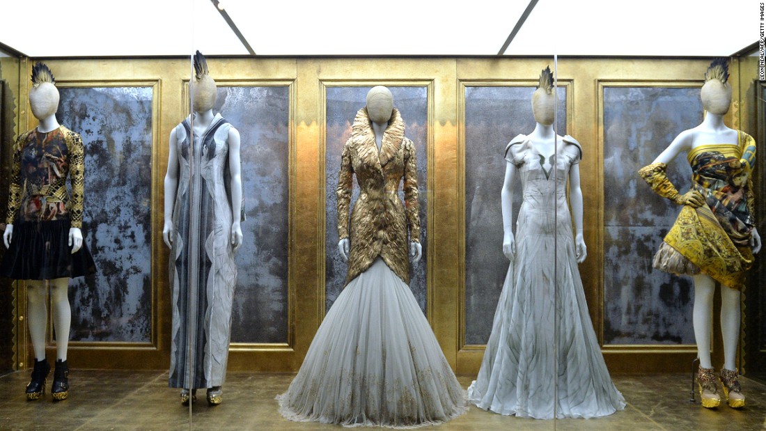
I am so fortunate to be living in New York City.  Inspiration is limitless.  It’s everywhere.  We have the flagships of all the best stores and most luxurious brands in the world, and we’re all trying to outdo each other with our Visual Merchandising programs and store displays.  There’s so much inspiration just from shopping.  I go to museums to get inspired.  We have world-class and once in a lifetime exhibits that feed the sous of creative and artistic types.  If you are fortunate enough to have seen The Met’s tribute to Alexander McQueen, “Savage Beauty,” you will never forget that experience.  The fusion of fashion, art, technology, and music to create a fully-immersive experience was amazing.  Even restaurant design in New York is amazing and a limitless source of ideas.  The materials, textures, lighting, menus, food presentation all work together to deliver a singular and signature experience.  TAO Downtown, SANTINA, Upland, ABC Kitchen, and The NOMAD come to mind.  Central Park with all its natural beauty is a limitless source of inspiration.


What or who inspires you?

My husband; he inspires me to always do my best work, to balance work and personal life, to enjoy family and friends, and to be the best person that I can be in all facets of our life.  My mother; she inspires me to be kind, thoughtful, generous.  New York inspires me, with all its fashion, culture, theater, art, architecture, restaurants. 


Where is your favorite vacation getaway?

A.jpg

It’s a big, big world with so many places to see, but we always end up on a beach.  I love beautiful beaches, meeting people, and understanding the culture through food.  I guess it’s a nice change from the pace of New York, but after a week on the beach, I miss the hard pavements of New York.  I even miss the Subway. I am so lucky to live in New York.  Tourists have to go home, but I live here!  (Did I mention that I love being a New Yorker?)

What trends do you think we will be seeing in the industry in the next 5 years?

Technology will continue to be a driving force.  There will be renewed focus on natural materials and sustainability, respecting the humble and authentic beauty of these materials.  The spirit of DIY is still very much alive.  With so many more shoppers going online, brick & mortar stores have the mission to bring customers into the stores, entertain them, and keep them in the store.  That’s where I play a part. My role is clear – engage and inspire the customer through the theater of Visual Merchandising, the theater that cannot be experienced online.

Q.jpg

What has been your favorite project?

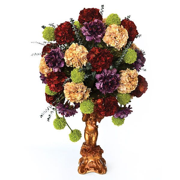
My sister’s wedding. OVER. THE. TOP.  600 guests.  Nine bridesmaids and groomsmen. I made the paper for the invitations, broke in to the Book Arts studio on campus to use an antique letterpress to print the invitations, and hand-sewed hundreds of invitations. I antiqued tall plaster cherubs holding up oversized floral arrangements (that I also put together).  60 cherubs, 60 arrangements.  I made 600 bottles of bath oil with lavender, sealed with beeswax, as the wedding favor.  We had the rehearsal dinner at my parents’ home.  I had a rolling rack of the nine bridesmaids’ dresses, each with a shopping bag that contained their shoes and jewelry – I was leaving nothing to chance or questionable personal style.  That was an insane amount of work, but it was truly a labor of love.

What is the best advice you’ve been given?

“Do what you love.  Love what you do.”  From my parents. When I decided to abandon the road to becoming Earl Montelibano, M.D., I told my family over Sunday dinner that I was going to be an Art major, that I wanted to sew paper, not sutures.  My family was very supportive.  I was always an independent child who thought for himself, and my family just thought this was normal behavior for me.  At the end of dinner, my father said , “I don’t care if you want to be a hair-dresser, but you must try to be the world’s best hair-dresser.”  (I found his comment funny because, at that time, I hadn’t come out to my family, and I thought, “Very interesting choice of professions to support your advice, Dad.”


Who is on the guest list for your ideal dinner party?

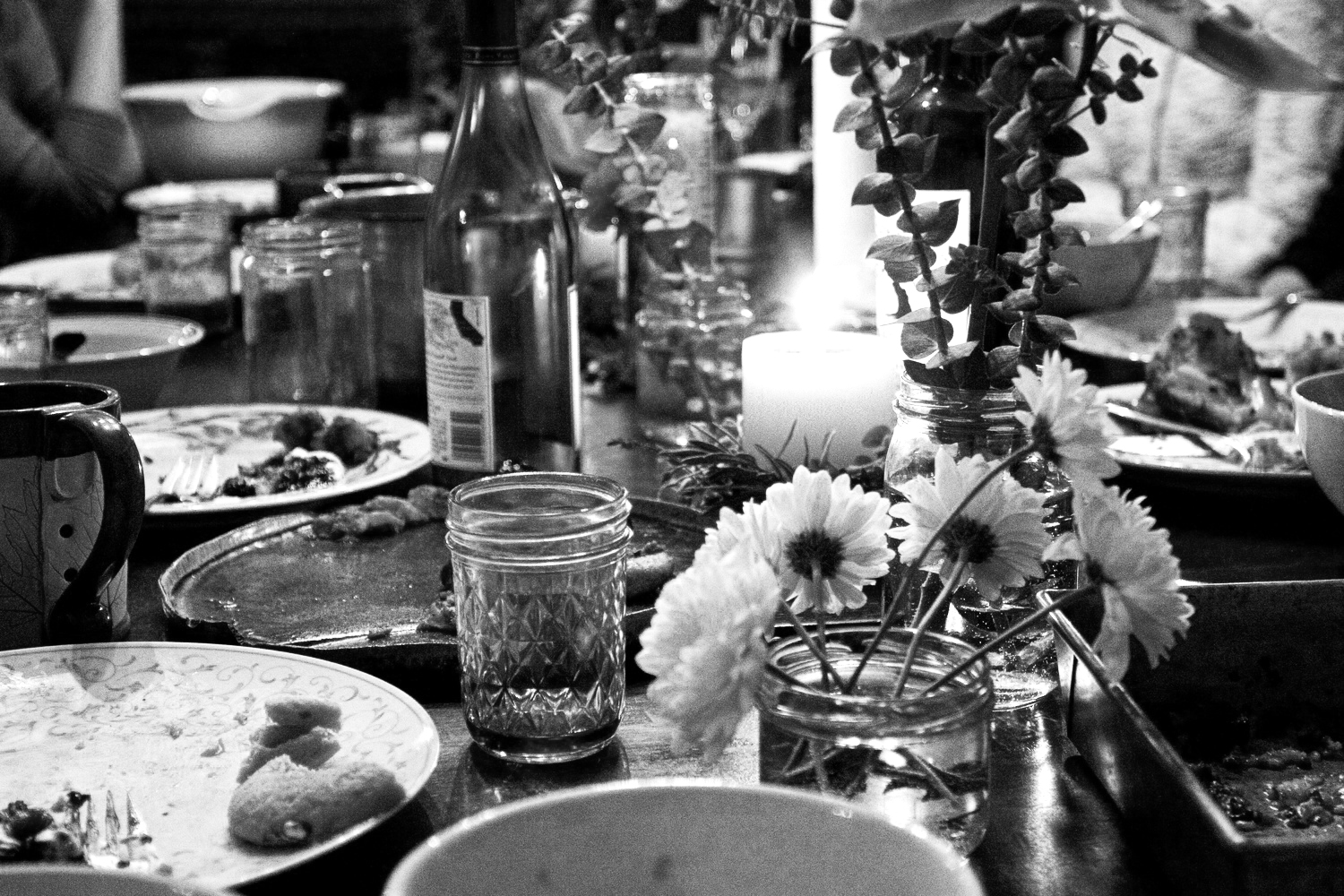
Anderson Cooper – he will have a lot to say about a lot of people.  It would be like he brought a hundred guests with him.  Madonna – I’ve always wondered why I was never a big fan of hers. What was I missing?  A pre-dinner cocktail with her would break the ice. Margaret Cho – she will be a riot, and we’ll never be able to keep food in our mouths.  Dinner will be on Madonna.  Bjork – I don’t really understand her music, but I like it.  She is from another world.  She can do double-duty and sing for her dinner.  She must come in her Swan Dress.  RuPaul – She is GORGEOUS and funny.  But she must come as RuPaul in full glamour drag, not as RuPaul Charles, the man in ill-fitting suits.  Lady Bunny – she can play DJ to Bjork.  Tilda Swinton – because she’s Tilda Swinton.  She’ll wear black and act bored, but Margaret Cho will make her crack a smile.  My mother – she has an amazing ability to make everyone feel comfortable, special, and loved.  I will forego the placecards because she’ll probably bring four friends without prior notice, but Mom is allowed to bring strangers who will become new friends.  It just makes for a more interesting night.  And she plays a mean Scrabble.  You know, for after-dinner fun.


If you were to give someone just starting out in the industry some words of advice, what would they be?

Work hard.  Trust yourself and your instincts.  Take risks. Follow your heart.  Find a mentor and friend who can help you to navigate the workplace and the personalities. 

What is on your bookshelf?

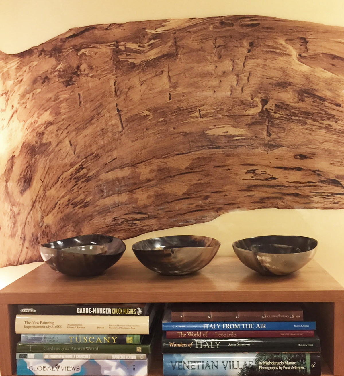
Our wedding photo, Alexander McQueen: Savage Beauty; Pierre et Gilles; The NOMAD Cookbook and the French Laundry Cookbook (impossible recipes, but gorgeous books); beach glass and rocks from vacations; At Swim, Two Boys; The City and the Pillar; Giovanni’s Room; my collection of white coral, NY dust.

What is the best gift you have ever received?

My husband threw a party for my 40th birthday.  All our families and closest friends were together.  I know how much work it was to pull this off, and he did it all for me.  It was truly special.

The Hamptons

THE HAMPTONS – LONG ISLAND, NEW YORK

The Hamptons, located just off of Long Island’s Gold coast, has long been known as the summer vacation spot for the rich and famous. With its’ white sand beaches that stretch out along the Atlantic Ocean, luxurious seaside homes, striking vineyards and exquisite eateries, people can’t help but fall for the Hampton’s iconic old fashioned country charm.


PHOTO: DAPIXARA – JANUARY 2015

PHOTO: DAPIXARA – JANUARY 2015

PHOTOGRAPHER SPOTLIGHT: DAPIXARA

Dapixara is a professional photographer that lives in Cape Cod, Massachusetts. He specializes in beach landscape photography, coastal photography, Cape Cod photography, and photography that is shot against the sun. His art has been shown in galleries, museums, calendars, and on TV. Dapixara is also a contributor to National Geographic, the Travel Channel, the Weather Channel, and many more.


PHOTO: MDS STRIPES – MARK D. SIKES

PHOTO: MDS STRIPES – MARK D. SIKES

PHOTO: MARK D. SIKES 

PHOTO: MARK D. SIKES


PHOTO: MDS STRIPES – MARK D. SIKES

PHOTO: MDS STRIPES – MARK D. SIKES

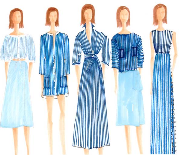
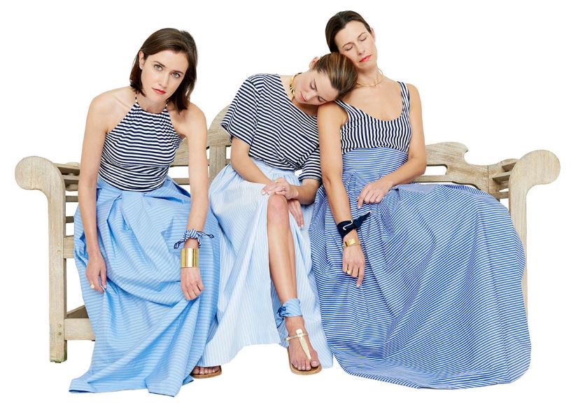
MARK D. SIKES – MDS STRIPES

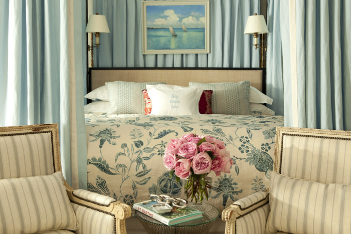
Mark D. Sikes formed his American Sportswear collection, MDS Stripes based off of his love affair with blue and white stripes and stylish women. His designs are a unique combination of classic and feminine. Outside of his clothing brand, Sikes spends his time working as an interior designer, where he blends his signature All-American, classic style with modern, European sensibilities.


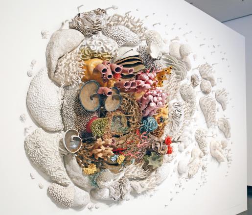
SCULPTURE INSTALLATION BY COURTNEY MATTISON: OUR CHANGING SEAS III

VIRGINIA MUSUEM OF CONTEMPORARY ART - Photo: Courtney Mattison

Handcrafted ceramic sculpture

THE_BEACH_EXHIBITION.jpg

INTERACTIVE ARCHITECTURAL INSTALLATION BY SNARKITECTURE: THE BEACH

NATIONAL BUILDING MUSEUM – Photo: Noah Kalina

Scaffolding, drywall, mirrors, and 750,000 recyclable plastic balls.


AD CAMPAIGN VIDEOS WE LOVE: GANT & RUGBY RALPH LAUREN

GANT: Spring Summer 2016

Rugby Ralph Lauren: Summer 2012


PHOTO: RYAN MOORE

PHOTO: RYAN MOORE

MONTAUK LIGHTHOUSE

Montauk Lighthouse is currently the oldest standing lighthouse in the state of New York. President George Washington authorized the construction of the lighthouse in 1792. The lighthouse is active and is maintained by the Montauk Historical Society. Today, the lighthouse is a National Historic Landmark attracting tourists from all over the world, eager to see the lighthouse’s historic All-American beauty.


PHOTO: ANNE-MARIE (THE HOUSE THAT A-M BUILT)

PHOTO: ANNE-MARIE (THE HOUSE THAT A-M BUILT)

PHOTO: ANNE-MARIE (THE HOUSE THAT A-M BUILT)

PHOTO: ANNE-MARIE (THE HOUSE THAT A-M BUILT)

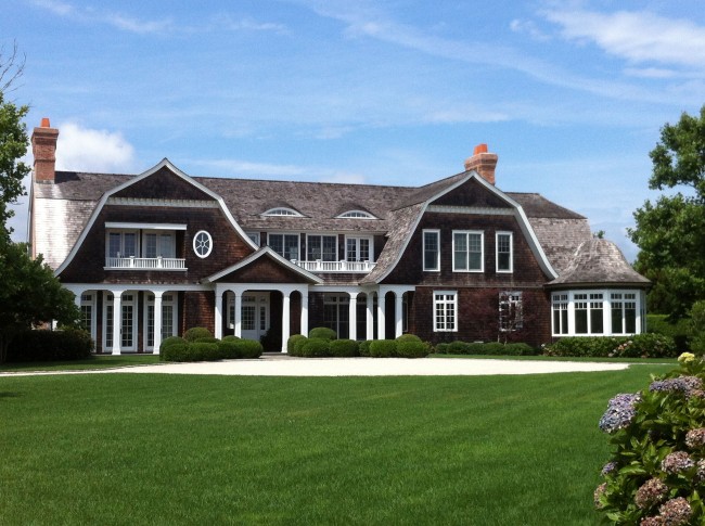
HAMPTONS STYLE ARCHITECTURE

True “Hamptons Style” architecture is a mix of traditional American design with rustic early settler utilitarian elements. Many of the original design elements were put in place to combat against harsh coastal winds and humid weather. Iconic features that define this style are: a gable style roof with shingles, large balconies, windows that are well positioned and spaced, a hint at the hierarchy of rooms, simple lines, and symmetry.

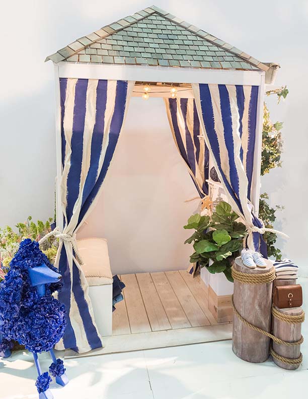
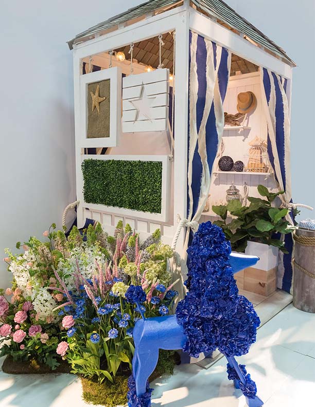
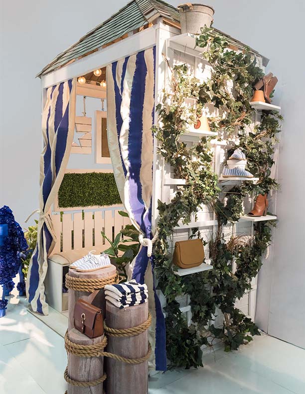
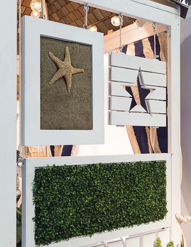
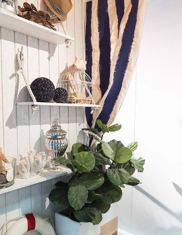
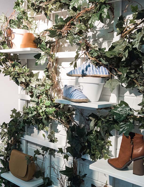
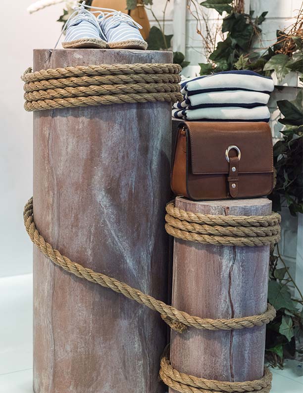
VISUAL DISPLAYS – HAMPTONS HOUSE BOOTH

All elements were handcrafted and created by Judith Von Hopf for GlobalShop 2016.

Introducing The Hamptons

Presented by Judith Von Hopf

The Silver Scene

0
0
2015-07-29T04:17:00Z
1
4
29
Judith von Hopf
1
1
32
14.0


Normal
0


false
false
false

EN-US
JA
X-NONE


 <w:LatentStyles DefLockedState="false" DefUnhideWhenUsed="true"
DefSemiHidden="true"…

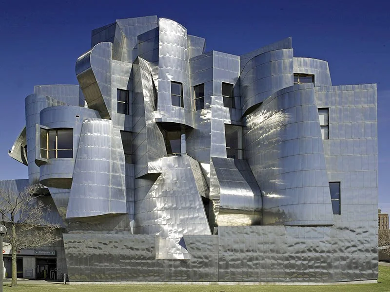
PHOTO: KENNETH JOHANSSON/CORBIS

WEISMAN ART MUSEUM – MINNEAPOLIS

Completed in 1993, the Weisman Art Museum is located on the University of Minnesota campus. Its western façade, featuring steel-clad turrets and bays, peeks over the bluffs of the Mississippi River. Construction of a Gehry-designed expansion concluded in 2011.

Frank Gehry was born Frank Owen Goldberg in Toronto, Canada on February 28, 1929. He studied at the University of Southern California and Harvard University. Gehry, based in Los Angeles since the 1960s, is among the most acclaimed architects of the 20th century, and is known for his use of bold, postmodern shapes and unusual fabrications.

0
0
2015-07-29T04:17:00Z
1
2
16
Judith von Hopf
1
1
17
14.0


Normal
0


false
false
false

EN-US
JA
X-NONE


 <w:LatentStyles DefLockedState="false" DefUnhideWhenUsed="true"
DefSemiHidden="true"…

PHOTO: JRC/ALAMY

WALT DISNEY CONCERT HALL LOS ANGELES

Gehry was shortlisted to devise a new home for the Los Angeles Philharmonic in 1988; the project, the Walt Disney Concert Hall, finally opened in 2003. Today critics and the public agree that the iconic building was worth the wait. Reflecting Gehry’s longtime passion for sailing, the structure’s exterior features expanses of stainless steel that billow above Grand Avenue, while inside, similarly shaped panels of Douglas fir line the auditorium.

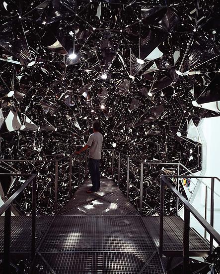
INSTALLATION BY OLAFUR ELIASSON: THE BLIND PAVILION

DANISH PAVILION, VENICE BIENNALE  Photo: Giorgio Boato 2003

La situazione antispettiva. Stainless steel

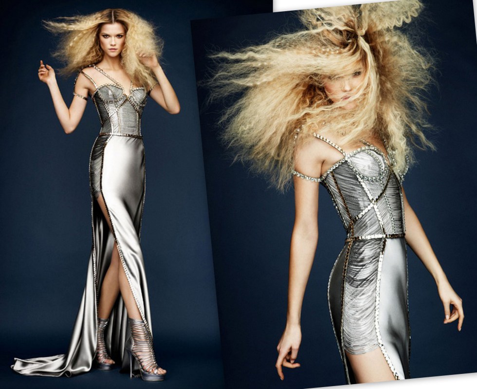
ATELIER VERSACE SPRING 2010

Exuding glamour and an almost palpable energy, Kasia Struss wows in the Atelier Versace Spring 2010 collection. With designs inspired by the Greco-Roman era and adorned with Swarovski crystals, the eleven looks take on a life their own life in the editorial-esque lookbook.

&nbsp; Backstage Photographer&nbsp;–&nbsp;Boy Kortekaas

  Backstage Photographer  Boy Kortekaas

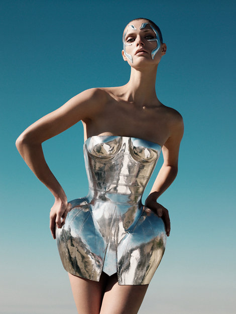
IRIS VAN HERPEN SPRING COUTURE 2013  

Dutch designer Iris van Herpen takes on the theme of electricity featuring 3D-printed ensembles.


ICONIC DRESS BY DOLCE & GABBANA

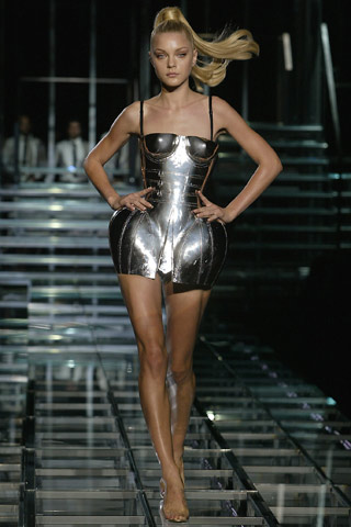
Dolce & Gabbana Spring 2007 RTW Metal Dress

DOLCE & GABBANA are set to represent Italian fashion in an exhibition charting the key moments in the history of contemporary fashion. Les années 1900-2000: Histoire Idéale de la Mode Contemporaine. Vol. 2 at the Musée Des Arts Decoratifs in Paris will feature two Dolce & Gabbana creations from collections over the past twenty years.

The first, a corseted armor-look dress from the spring/summer 2007 New Sexy Glam collection was worn by Lady Gaga in the video and cover artwork for her song Paparazzi.

The second, a corset embellished with colorful stones and charms, was modeled by Naomi Campbell on the catwalk of the autumn/winter 1991-92 collection, known as Le Pin Up. It was then consecrated in fashion legend when Madonna wore it to the 1991 premiere of her film Truth or Dare in New York.


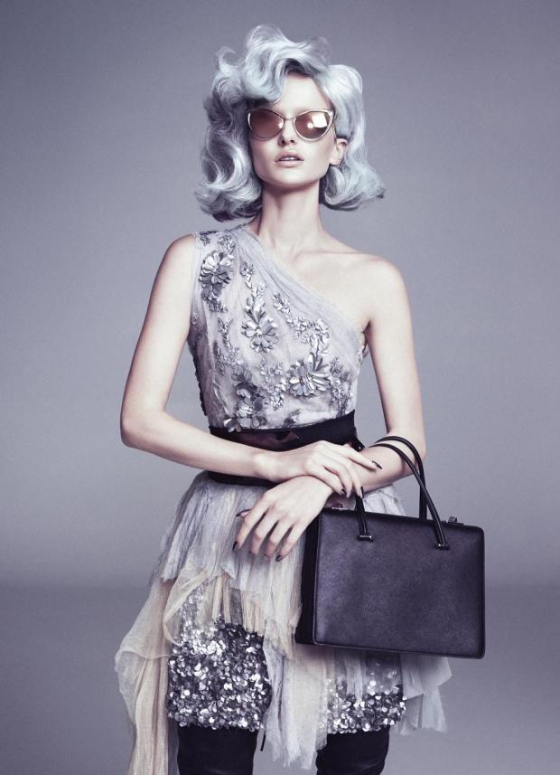
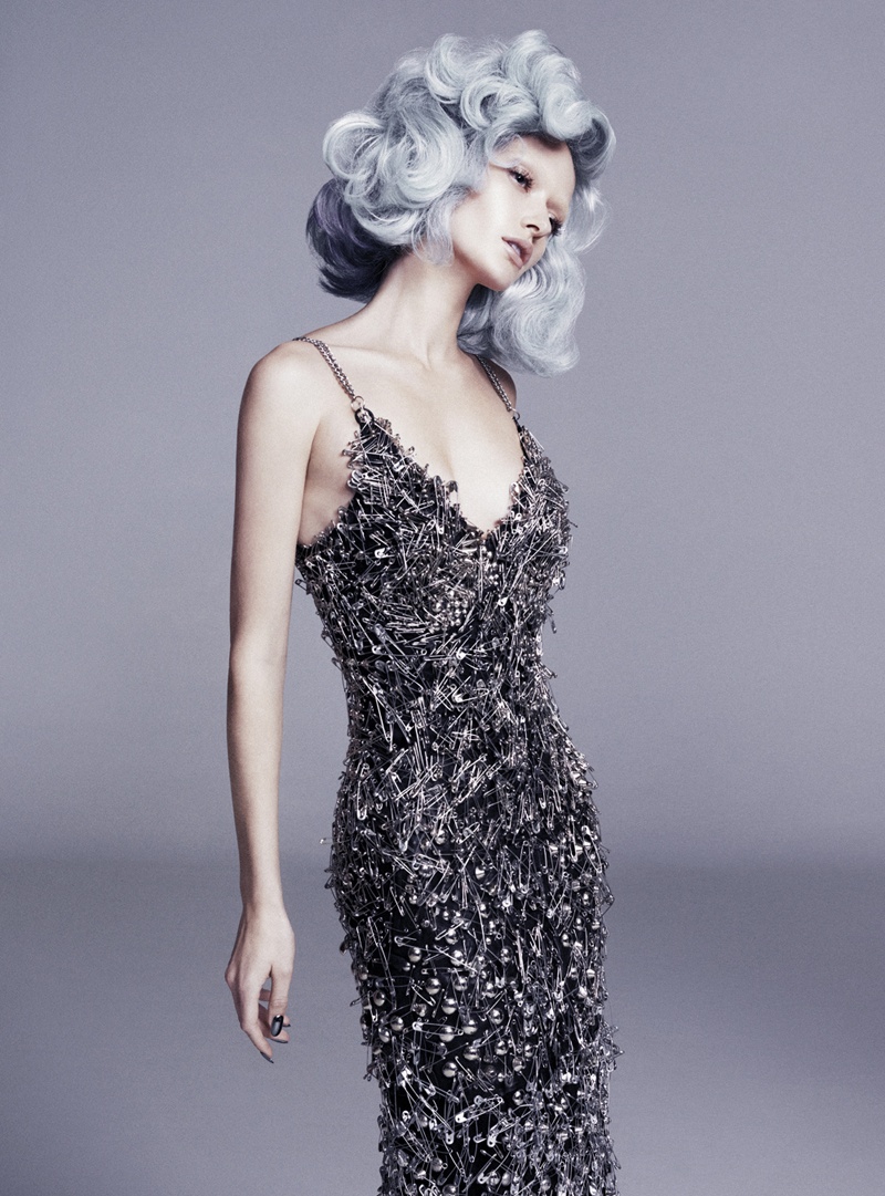
EDITORIALS WE LOVE: ANNABELLA BARBER FOR FASHIONTREND AUSTRALIA 

Shot By Christian Blanchard  Images courtesy of FASHIONTRENDS Australia

Model: annabella barber (img)

Photographer: christian blanchard (dlm)

Stylist: michael azzollini (dlm)

Hair and make-up: sarah laidlaw (dlm)

Manicure: zoe vokis (dlm)

JEWELRY INSPIRATION

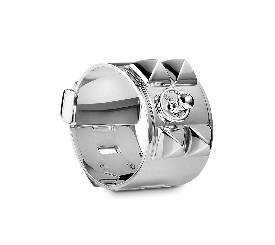
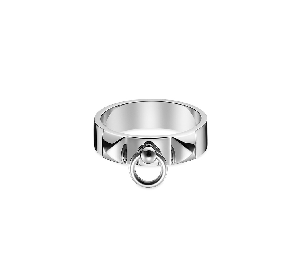
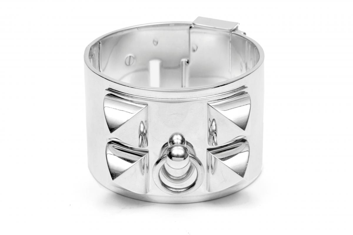
The Hermès Collier de chien bracelet has been the “it” item for years and recently experienced a new boom in popularity.

Inspired by the ever-chic Collier de chien belt that was first introduced in 1927, the bracelet is believed to have been introduced into retail in the 1940s. Although we cannot account for the style's popularity throughout the twentieth century, ever since Pierre Hardy's entrance into the house in 2002, Hermès has been a leader in the silver jewelry market and the Collier de chien has clearly been at the forefront. In fact, in the company's annual report for 2009, the Collier de chien ring and bracelet were both pointed out as particular successes of the year.

It’s possible the bracelet was exposed to the masses through the rise of the editor-turned-it-girl phenomenon and the influence of certain celebrity stylists like Rachel Zoe, the bracelet seems to represent a new class of royalty here in America – those with new money, in-the-know, and belonging to a certain social circle. Created by one of the most luxurious houses today, the Collier de chien certainly holds an air of exclusivity.

Several celebrities have been seen wearing the bracelet in recent years as well as reality TV star and fashion PR go-to Andrew Mukamal, who became known for his Collier de chien bracelets (he has at least two: all black leather, as well as a black and silver one).

Kate Lanphear, ELLE's style director included the iconic bracelet in rose gold with brown diamonds as one of her editor's picks in the August 2010 issue, and has been seen wearing the style for years. Designer Tory Burch was seen wearing her own printed version in her cover story for the September 2010 issue of Town and Country, and on the season three premiere of "The Rachel Zoe Project," the celebrity stylist Zoe herself was seen wearing one. Today, it still stands to be the ultimate in silver cuff cool.


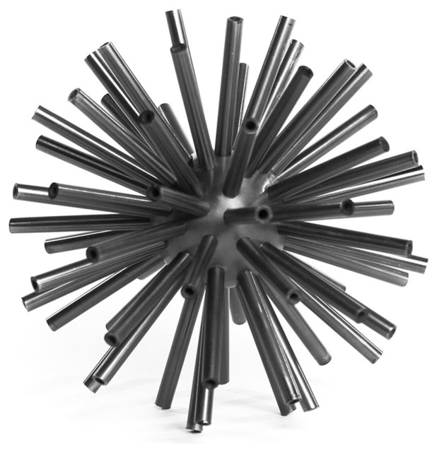
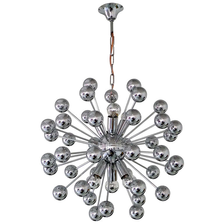
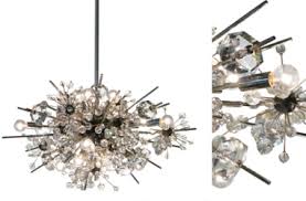
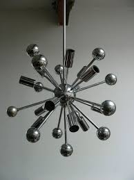
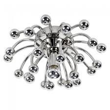
ICONIC LAMP OF THE 60s: THE SPUTNIK CHANDALIER

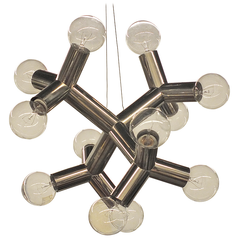
The Sputnik chandelier was created in 1960, three years after the actual launch of the Sputnik space shuttle. The futuristic form of this lighting fixture, with its multiple splayed arms and expansive effect, made it a staple decor element of the period.


Introducing The Silver Scene

Presented by Judith Von Hopf

Whimsical & White

judith-von-hopf

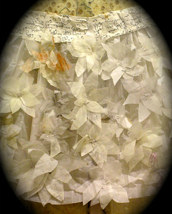
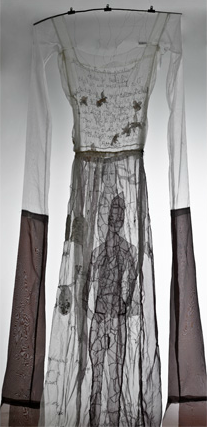
Paper Dress By Laura Baruel

(http://baruel.dk)

Installation

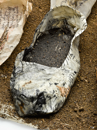
Phantom Limb
By Motohiko Odani
This installation is currently on show at the Mori Art Museum in Tokyo.(www.lamauvaiseherbe.net)

Art – Mixed Media

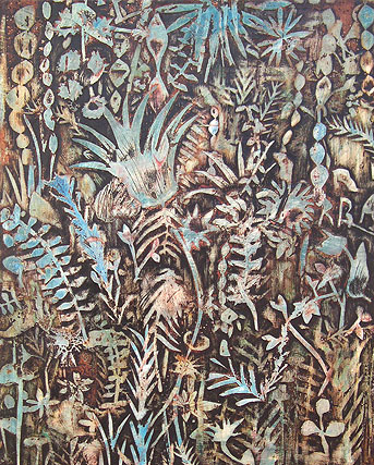
By Cynthia Fusillo
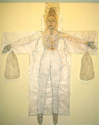
An Artist and dear friend of our president, Melissa von Hopf, Cynthia is a poet and an extremely talented artist. She has her masters in Fine Art and Psychology and currently resides in Barcelona, Spain.  (www.cynthiafusillo.com/)


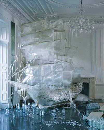
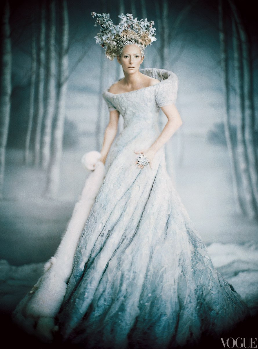
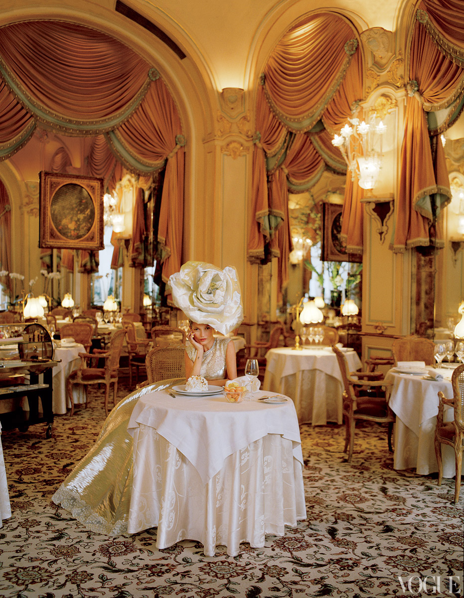
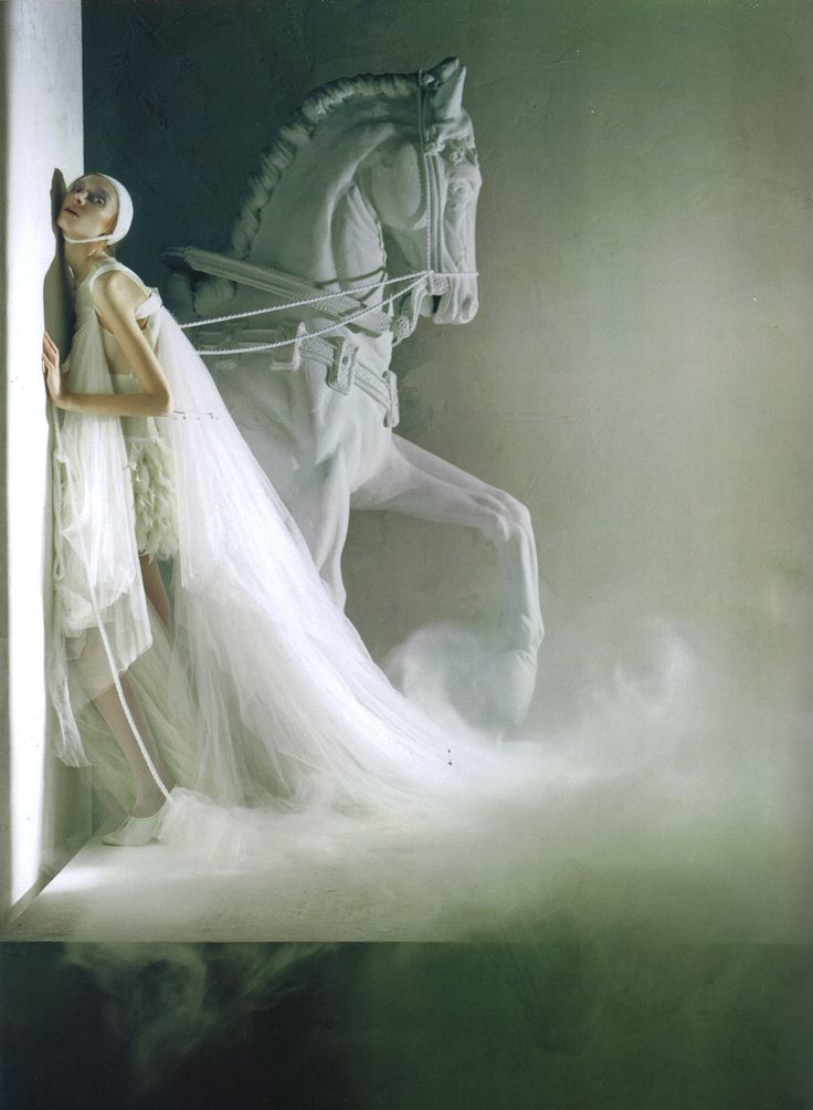
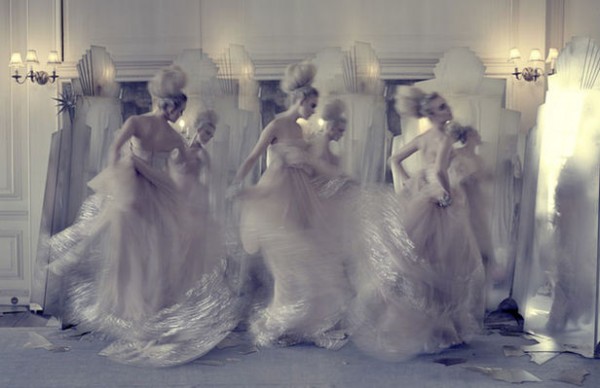
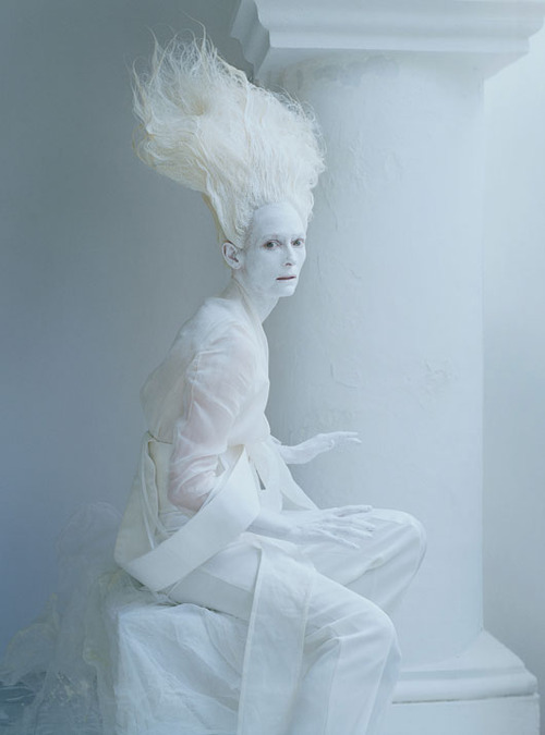
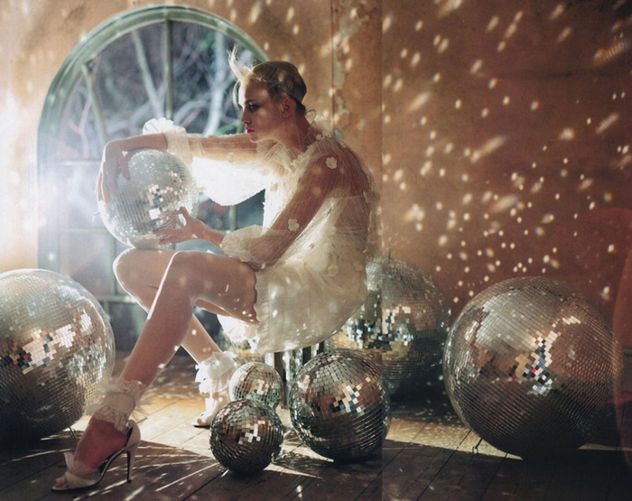
Tim Walker

Responsible for some of fashions most magical, whimsical and exquisite imagery, British photographer Tim Walker is one of the most creative photographers working today. Walkers highly produced sets are fantastical environments, often highly allegorical. Walker often plays with proportion, casting his models as giants in a shrunken world, or the reverse.

Walkers first step towards his career in photography was a work experience placement at Condé Nast for the duration of his gap year, during which the aspiring photographer worked on the publishing companys Cecil Beaton archive. Contemporaneous to this, Walker entered The Independents photography awards, which led to a three-year photography BA (Hons) degree at Exeter College of Art.

Following his graduation Walker moved to New York to take up the enviable position of Richard Avedons first assistant. When he returned to London Walker focused on portraiture and reportage for the newspaper industry, however in 2005, aged 25, Walker shot his first fashion story for British Vogue. He has now contributed to a slew of high-profile magazines including Vogue, W and Harper's Bazaar and has shot two front covers for British Vogue - Lily Cole on the July 2005 cover and Stella Tenant on the November 2005 issue. Commercially he has shot advertising campaigns for clients as wide ranging as Barneys New York, Comme des Garçons, Gap and Yohji Yamamoto.

In 2008, his first major exhibition was held at the Design Museum in London, coinciding with the publication of his first book, entitled Pictures. In the same year Walker received the Isabella Blow award for Fashion Creator at the British Fashion Awards. In May 2009, he received an infinity award from The International Centre of Photography in New York for his work as a fashion photographer. Both the Victoria & Albert Museum and the National Portrait Gallery in London have Tim Walker photographs in their permanent collections.

In 2010 Walkers first short film, The Lost Explorer was premiered at Locarno Film Festival in Switzerland and went on to win best short film at the Chicago United Film Festival, 2011. 2012 saw the opening of Walkers hugely popular Story Teller photographic exhibition at Somerset House.

Walkers believes that a camera is simply a box put between you and what you want to capture. What he wants to capture is invariably what many revel in seeing.

(http://www.businessoffashion.com/community/people/tim-walker)

The Invisibles

By Tokujin Yoshioka

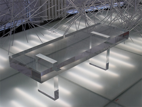
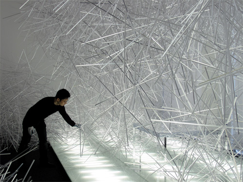
Want to know whether is it possible to create an invisible chair? It has already being produced by Japanese designer Tokujin Yoshioka. This amazing piece fits nicely in any space...a perfect camouflage furniture!

Italian furniture producer Kartell will release The invisibles designed by Japanese designer Tokujin Yoshioka. Above are images of the shop installation  titled Snowflakes, which promotes The Invisibles.

image_62756.jpg

Ostuni, Italy

One of Puglias best looking towns, Ostuni stands out for its stunning 15th- century Gothic cathedral and bright, white washed historic center. It is situated in the province of Brindisi, about 8 km inland from the enticing Adratic shores, and is a breathtaking illustration of Mediterranean architecture with medieval touches.

A lively and intriguing maze of cobbled narrow alleys, arches, staircases, and atmospheric piazzas all dipped in dazzling white paint make La Città Bianca one of Southern Italys most striking little towns.

image_62756.jpg

Pueblos Blancos

In southern Spain, in the autonomous community of Andalusia, between the Atlantic in the west and the Mediterranean in the east, lies some of the prettiest towns in Spain - perfectly whitewashed with red and brown tiled roofs, narrow, winding, cobblestone streets, and ornate churches atop cliffs and river gorges, and all offering rolling views of the hills below. These are the famous White Towns of Andalusia, or Pueblos Blancos. The towns are located the northern part of the provinces of Cádiz and Málaga in southern Spain, mostly within the Sierra de Grazalema Natural Park.

The Towns were originally built and settled by Berber farmers from North Africa who came to Andalusia between the 9th and 10th centuries - the early heyday of Moorish rule. While the Moors were in charge, these farmers peacefully worked the valleys. By the late 11th century, when the Christian Reconquest began to topple the Muslim kingdoms in Northern Spain, these farmers began heading for the hills. Choosing the highest vantage points, some of which had already been the sites of former Roman settlements, and enclosing their streets of Moorish-style whitewashed homes in fortified walls, they found safety in their isolated pueblos. Although the Catholic troops eventually triumphed, it is often the Moorish influence that makes these towns architecturally interesting, with their labyrinths of narrow, cobblestone streets, their fortress-like walls, and their little whitewashed houses with the characteristic wrought-iron grilles. Despite having a distinct, Arabic feel to them, each village has at least one Roman Catholic church a sign of Catholic victory over the Muslims.

Whitewashing buildings were done because of the antibacterial properties of the alkaline whitewash, and also because a wholly whitewashed village appears socially cohesive. However, it is nevertheless a fact that there is no evidence that the majority of the villages were whitewashed before the 1920s. Indeed, investigation of paint layers on the buildings have revealed that few were whitewashed before that time, and further, that an array of pigments were added to the annual whitewashing activity, chiefly red and yellow ochres. Some decorative effects were also recorded, from the eighteenth century onwards, in a number of villages. These colored buildings survived until the dictator Miguel Primo de Rivera passed an instruction to the leader's local political allies to suppress differences in villagers' choices and to disallow any deviation from a politically engineered appearance of normality.

(http://www.amusingplanet.com/2013/04/the-white-towns-of-andalusia.html)

Introducing The Whimsical & White Collection

Presented by Judith von Hopf
judith-von-hopf

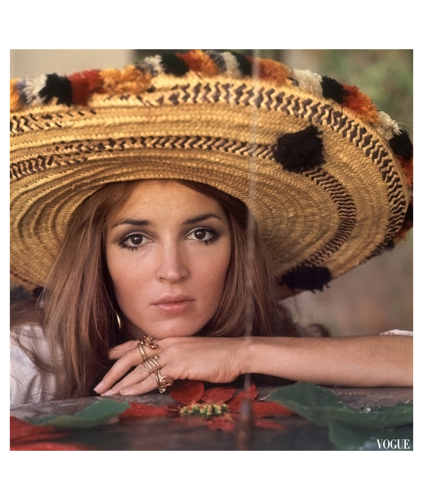
Style Icon: Talitha Getty

Who: Talitha Getty, nee Pol

What: Actress/model, socialite, and wife of John Paul Getty II

When: 1940 - 1971

Why: Talitha was the leading lady of the 60s bohemian jet-set and is credited with pioneering the boho-chic style, influencing generations of designers and fashionistas even today.

talitha getty

Talitha Getty's Story

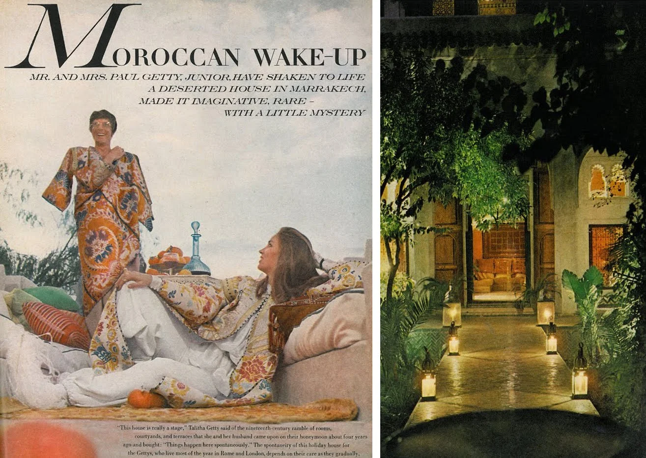
You can't talk about boho style without first discussing Talitha Getty, the woman with whom it all began. Born to Dutch parents in Java in 1940, Talitha Pol's life wasn't always glamorous. She spent her first four years of life in a WWII Japanese POW camp. When the war ended, Talitha and her mother moved to London. Her mother died soon after, leaving young Talitha to fend for herself. She enrolled at the Royal Academy of Dramatic Arts and appeared in a few movies. Although she never quite made it big as an actress, the extraordinarily beautiful Talitha did capture the eye of many a gentleman in London society. In 1965, she met oil heir John Paul Getty II at a dinner party, and by 1966 the two were married.
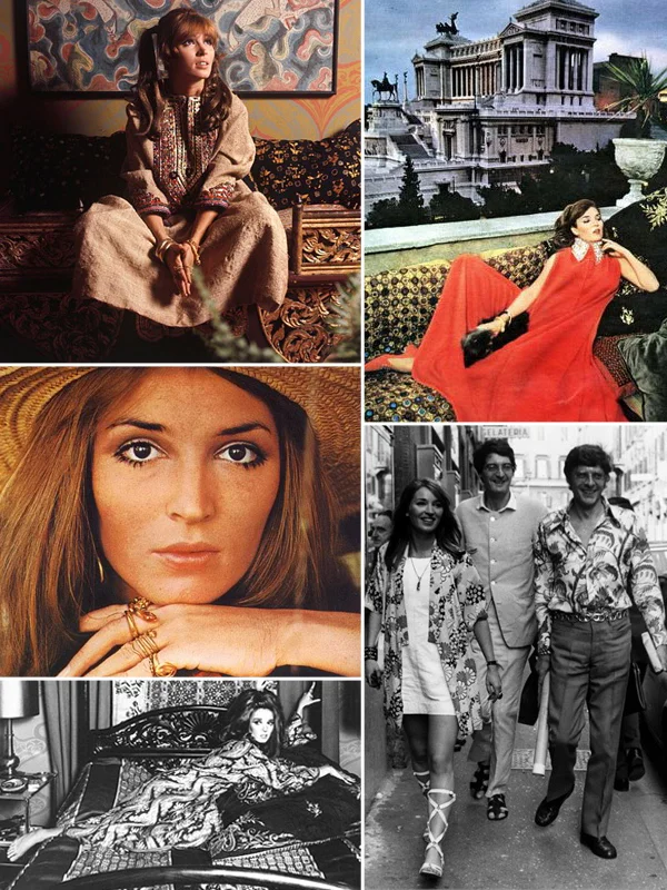
With limitless resources, the couple joined the then-burgeouning international jet-set, splitting their time between London, Rome, and Marakkech. It was in Morocco where Talitha's free-spirited bohemian sense of style truly took shape. Mixing couture pieces with ethnic finds and then piling on loads of costume jewelry became her signature. Printed silk caftans, embroidery, tassels, fringe - Talitha was not afraid to make a statement with her psychedelic style. The Getty's Marakkech home came to be known as "The Pleasure Palace" and played host to a revolving cast of 1960's artists, musicians, and rich young elite, including the Rolling Stones and The Beatles.
American Vogue editor Diana Vreeland recognized Talitha as a rare truly original style icon and featured Talitha, as did French Vogue, and famed photographer Patrick Lichfield photographed her. Talitha inspired such iconic fashion designers as Valentino and Yves Saint Laurent, who is quoted as saying "I knew the youthfulness of the Sixties (...) Talitha and Paul Getty lying on a starlit terrace in Marrakesh, beautiful and damned, and a whole generation assembled as if for eternity where curtain of the past seemed to lift before the extraordinary future". "Beautiful and damned" encapsulates Talitha Getty's life well, as beneath the glamorous surface there was a dark reality - both Talitha and her husband were terribly addicted to heroin. In 1971, at only 30 years old, Talitha took a lethal dose of heroin. She was a beautifully tragic creature, at once a troubled soul and free spirit. As Diane von Furstenberg put it, "a very bright creature who wanted to dance under the stars—and danced too fast." However tragic and untimely her death, Talitha's sartorial legacy continues to inspire even 40 years later.


Talitha Getty's Style

talitha-getty-judith-von-hopf

The Muse:

How Talitha's Style Influenced Our Collection

judith von hopf talitha getty bohemian collection